Henry James's Caslon
During this extremely early stage of dreaming up a model for digital scholarly editions of Henry James’s fiction, I’ve had the most pleasure thinking about fonts. Some of the excitement activates roughly the same neurons as when I browse pearl strands online: the sheer decorativeness of typefaces makes gazing on their forms, emptied of content, rewarding enough. Still, the very allure of particular fonts depends on their historical weight as past uses of the font for particular texts in particular contexts subtly shape your expectations of the words embodied by that font. A typeface is crucial for the transmission of meaning, not a superfluous decoration independent of it.
Through trails of barely-conscious associations, a font communicates through the eye a worldview. The popularity of ridiculing Comic Sans is just as much about establishing the sophistication of the ridiculer as it is about the typeface’s poor kerning. And a Jean Rhys novel wouldn’t seem so Rhysian to my generation of modernist scholars if were not distinctively set in dreamy, lanky Perpetua. For me, then, choosing the wrong font for Henry James would be self-incrimination tantamount to a lack of field expertise. It would suggest a lack of professional and aesthetic judgment, even—in the fevered, cultish world of single-author literary studies—a kind of breach of faith.
In the case of James, I began with a few simple guidelines. The typeface must telegraph “oldness” (so a nice Dutch Old Style serif font) but must avoid the gimmicky sentimentality of the kind of consciously antiqued fonts you see at Colonial Williamsburg. It had to say, “This is a smart novel, and you are smart for reading it.” (We musn’t flinch from articulating the peculiar attractions of James.) At the same time, it still must be streamlined to some degree: you will be reading a James text for a long time! My favorite novel, The Ambassadors, clocks in at around 165,000 words (taking the average reader 11 hours), rates a 10.52 grade level in the Flesch-Kincaid Grade Level scheme, and flaunts a 13.55 on the Fog Scale, somewhere between “hard” and “difficult.”
Legibility is an issue.
I don’t buy into the claims (being debunked as myths) that sans serif is always better for screens. These claims are based on increasingly obsolete evidence. I plan on following the guidelines developed by Richard Rutter in his amazing adaptation of Robert Bringhurst, “Elements of Typographic Style Applied to the Web”, thereby mitigating serifs’ alleged fuzziness in digital contexts. As Alex Poole concludes in his summary of his master’s research on the topic,
we should accept that most reasonably designed typefaces in mainstream use will be equally legible, and that it makes much more sense to argue in favour of serif or sans serif typefaces on aesthetic grounds than on the question of legibility.
Let’s luxuriate in the aesthetic concerns, then.
I wanted generous counters and bowls that would reward the blank staring one often resorts to when reading late James. No light-hearted hairlines or ultra-thin descenders or ascenders would be allowed: the reader’s eyes would need to have something to rest on, to chew on. Heavy serifs were needed to train the reader’s eyes on the correct line. The letters of Henry James’s name had to be particularly nice, as the name would be repeated so frequently throughout any user interface that the name itself would essentially constitute a non-negotiable design feature. In the New York Edition of his works—the de luxe edition of fiction that James hand-selected, revised, and prefaced, published by Scribner’s from 1907-9—here’s how his name appears:
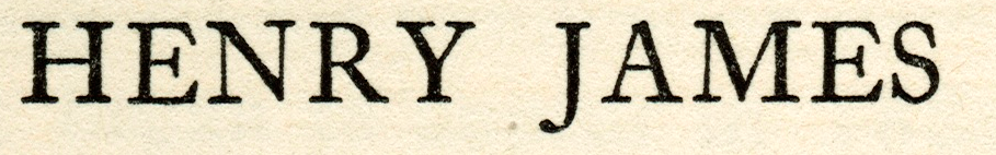
Yummy. Taking cues from here, the “H” needed a good long crossbar to appear square, the “J” needed a generous hook so the last name begins confidently, the gap between “R” and “Y” needed to be tight to be distinguished from the space between first and last names, the “E” (appearing twice in his name, in the second and second-to-last positions) needed to be detailed, not too blocky. Knowing that titles, too, would loom large, I wanted noteworthy articles: a dignified “A” with a strong presence and an elegant “Th” ligature. The “S” and “s” are, I think, a bit pinched, but that is only my personal taste. If I could manage equal widths in the first and last name (both having 5 letters), some cool design options for the logo would open up without having to fuss with spacing ratios.
Beyond these hunches, James’s correspondence regarding the New York Edition provides a fairly clear shortcut for selecting a font that would satisfy him. (Don’t we not really mind about authorial intention any more? Is it merely the context of creating an edition that smiles on intention? Is authorial intent a shibboleth, or is it the infancy of digital literary studies that allows minor sins to pass?) We know James, ever a grand noticer of details, loved the physical appearance and page layout of the New York Edition: he wrote breathlessly to his editor that he was “serenely content” and “ridiculously proud of it”.
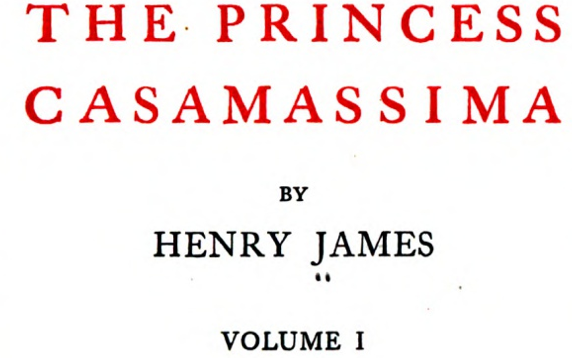
As well he should be. Look at the upper title page of The Princess Casamassima:
Using the usual suspects to identify the typeface, from WhatTheFont and IdentiFont to WhatFontis and my personal favorite, the Serif Font Identification Guide, as well as some good old-fashioned mucking around typing out “Henry James” ad nauseum till an option felt right. I settled on Caslon.
I love Caslon for so many reasons. It’s the default typeface of my adolescent reading of “the classics,” so it’s as cozy as a cashmere sweater for my eyes. The concave (“hollow”) apex of the “A” is luscious, giving a rakish, forward-moving feel to sentences that begin with the article “A.” The “J” descends, lending some dynamic movement to “James,” and the ear on the “g” is friendly but not cutesy. And I love the dangerous, crashing feel of the italics “A,” “V,” and “W” as they lean on the rest of the word.
It has the additional virtue of not already being claimed by the major James online presences already in existence, so it is thematically (perhaps even historically) appropriate, but also fresh for the digital environment. The Henry James Society relies on Palatino, Adrian Dover’s The Ladder on Georgia, Richard D. Hathaway’s Scholar’s Guide on Times New Roman, Greg Zacharias’s Center for Henry James Studies on Book Antiqua, and Michael Anesko’s Portrait of a Lady Cambridge edition site on Garamond.
Beyond the question of which typeface, there is the question of whose. And that decision depended on two criteria—aesthetic appeal and technical capacities. As for aesthetics, I typed some options until I narrowed it down to three versions: William Berkson’s Williams Caslon, Carol Twombly’s classic Calson for Adobe, and Dalton Maag’s Kings Caslon:
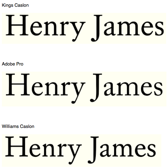
The heavy Kings would probably be unsustainable for long blocks of text. The Adobe is a modern classic, for sure, but the quirkiness of the Williams version feels a bit more human to me. The “J” and “a” in his last name look like they’re on better terms with each other in the Williams and Kings. The terminal on the Adobe “a” has more of that crispy modern feel I wouldn’t want. The Kings “y” descender is pretty much a mess, whereas that of Adobe and Williams have that jaunty feel that comes from the “y” and “J” descenders differing in length. The “s” looks all wrong in Kings, and even though I am not particularly a fan of the slim “s,” it does suggest those qualities of restraint and reconsideration—plural words seem to be pulled up, yanked close, by that slim “s”—that I associate with James’s fiction.
Then there are the technical issues influencing which Caslon to choose. I’d need a high-quality, uncompressed font to maximize legibility within a longform reading experience. I’d need to ensure web-readiness and consistency across browsers and platforms—preferably in OpenType and with a self-hosting option to ensure that every user would actually see the same font. Google fonts are slowly getting prettier and better in general (this blog in fact uses Google’s Georgia and Josefin Sans), but their closest shots are their Libre Baskerville and EB Garamond (both of which make me sad when I try them out in big blocks of text).
On top of these technical details, the font set would need to include
- Small caps
- True italics and bold typefaces
- Both lowercase and uppercase numerals
- A generous and creative selection of ligatures
- A smattering of swashes and decorative printers’ glyphs (fleurons, daggers, and the like)
- A more of less complete array of foreign accent marks (with an emphasis on elegant French diacritics)
No free typeface would satisfy all those demands. Paying is probably the best way to ensure prompt, reliable, continuing support, besides which, I’m certainly not against paying someone for his/her labor. (Plus, I think James’s ghost might get offended if I did it on the cheap.) And when that person writes such a fun, thoughtful, and absorbing explication of his process—“Reviving Caslon” part one and part two—well, I’m gonna go full Fry on it.
Or when, you know, any grant sources kick in. The nice people at FontBureau set up a free trial for their Williams Caslon webtype, long enough get a decent enough prototype going to know that this Williams Caslon is the right answer. It’s a beautiful font, and exactly what I wanted: a modernized version of the New York Edition font that’s got the technical chops to handle all the problems James texts will throw at it. Williams Caslon has the right balance of old-style beauty (to awaken those primitive attitudes of readerliness) and streamlined clarity (to suggest that the text has been edited for today’s digital demands for crystalline contrast).
Sure, it would be nominally easier and definitely cheaper to trust the arch websafe choices like Times New Roman or Georgia, but given that we read familiar typefaces faster than unfamiliar ones, I’m going to make all the design choices I can to ensure that we revel in a James tale or novel—bathing in it, not blazing through it!